Best Responsive Web Design Trends for 2017
 Even as 2017 draws to end we can still witness tons of challenges in designing responsive websites. Blame it on the multitude of devices with varying screen sizes and resolutions that are appealing users of all demographics around the globe, while making the work even more complex for the web designer communities.
But will it be acceptable to again loiter around the responsive web design trends when we have moved so much further?
Well, it’s definitely permissible, because it’s never late to learn something new, right? Also, haven’t you heard about the mobile-first strategy?
Also, read this,
- Global corporations are training employees for new age technologies through adopting best learning and development trends.
- The trend list even includes wearable devices, which will be used for training the employees on the go.
So it’s quite clear that responsive technology is definitely here to stay.
Now, just to warm up the discussion let’s take in the basic definition.
What is Responsive Web Design?
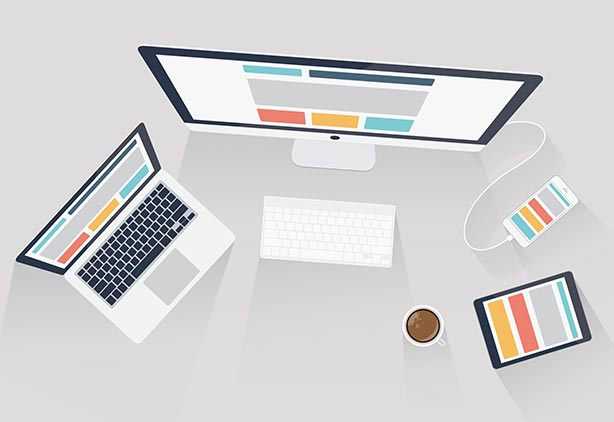
Responsive web design (RWD) helps in laying out web content for a wide range of devices of varying screen size and resolutions.

Source: ironpaper
Your website will not do any business if it’s still sitting on the desktop.
So the only credible option left with you is to look forward to adopting few good responsive web design trends that will keep the website up and running on every device.
- Brutalism/ Brutalist Design
- Wondering about the word?
- Well, if you are not aware, then brutalist design is one of the popular web design trends of modern technology.
- The brutal web design clearly turns down the concept of conventional, professional/tidy looking websites. Acknowledged as the ugliest web design trend, brutalist design is taking over the internet by storm.
- But on the same time, the brutalist web design is not for everyone. The UX trends designed through unconventional and unpolished coding practices may put off the audience who are used to clean well-cut website designs.
- It’s easy to identify a website with brutalist design as the raw appearance speaks it all, bold colors, in your face designs and texts (website elements fight for the spot). Designers working on the brutalist concept should strip website of its basic elements and employ repetitive, unpredictable geometrical patterns that would do nothing to emotionally connect with the audience.
- The most recognizable website that has utilized this rugged trend is Bloomberg.
- Device Specific Microinteractions
- Responsive technology is a simple concept, it allows websites to adapt to the screen size of whatever the device is being used, but is that sufficient to provide a good user experience?
- From good user-experience to killer user-experience, how do our web designers redefine the approach towards bringing out those tiny moments of enhancements? Of course, through microinteractions.
- What is engaging in microinteractions?
- – Changing/adjusting the settings in a device.
- – Syncing data or devices.
- – Setting alarm, password, or status message.
- – Controlling the music volume
- Spilt Screen Design
- Split screen design websites share the concept of card-based pattern.
- But why do we need a website with split screen design?
- Suppose you want customers to choose between two major services that you are providing, then having a website with spilt screen design helps to prominently display those options.
- Rule of Split Screen Design – One Screen. Two Messages
- The split screen design concept is considered the best choice for the responsive framework for navigation across large screen hand-held devices.
- Tips to make Split Screen Design Appealing
- – Contrasting color combination
- – Bold typography
- – Prominent call-to-action for channelizing supreme focus
- – Layering single text across two screen and increase the cohesiveness
- Card Based Interfaces
- Generally, what can be envisioned when we hear the word ‘card’?
- Also, designing card based interfaces for websites, what does it mean from the UX design perspective?
- We can visualize organized content structure that promises better in-depth information through clean and creative visuals.
- Card-based interfaces are visually pleasing and allow users to easily digest the complex content architecture.
- The most important point to be noted is the card-based interface design definitely fits for the responsive technology as they can be easily scaled to the device of varying sizes, giving visitors the best user experience.

 +91 8277203000
