Adaptive Design: Creating Seamless Experiences Across All Devices
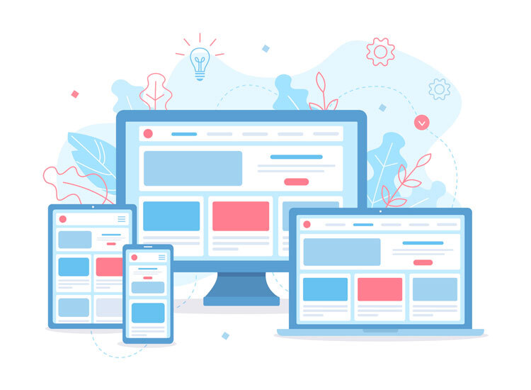
Adaptive website design is more important now than ever before, as users are accessing websites from a wide range of devices and screen sizes. While mobile-first design has been a popular trend in recent years, it’s important to understand that it is not just a passing fad. By using flexible grids and breakpoints, designers can ensure that their websites look great and function well on any device, whether it’s a smartphone, tablet, or desktop computer. By enhancing the user experience with device-specific features and optimizations, adaptive website design can help businesses reach a wider audience and improve their overall online presence.
Why Mobile-First Isn’t Just a Trend—It’s a Necessity
With the increasing use of smartphones and tablets, more and more people are accessing the internet on mobile devices. This means that businesses need to prioritize their mobile user experience to ensure they are reaching their target audience effectively.
Having a mobile-first approach means designing websites and applications with mobile users in mind first, rather than as an afterthought. This includes optimizing for smaller screens, faster load times, and easy navigation on touchscreens. By prioritizing mobile usability, businesses can provide a seamless experience for users on the go, leading to higher engagement and conversions.
Search engines like Google now prioritize mobile-friendly websites in their rankings, making it essential for businesses to have a mobile-first strategy for SEO purposes. With more people searching on mobile devices, businesses that don’t prioritize mobile optimization risk falling behind in search results.
Flexible Grids and Breakpoints: The Mechanics of True Responsiveness
A flexible grid allows for the layout of a website to adapt to different screen sizes, ensuring that the content remains readable and visually appealing on any device. Breakpoints are specific points at which the layout of the website changes to accommodate different screen sizes. By using flexible grids and breakpoints, website developers can create a seamless user experience across all devices, from desktop computers to smartphones.
The mechanics of true website responsiveness involve careful planning and consideration of how content will be displayed on different screen sizes. Designers must determine the optimal breakpoints at which the layout will change, taking into account factors such as font size, image size, and spacing. By creating a fluid and adaptable design, websites can provide a consistent and user-friendly experience for all visitors.
Incorporating flexible grids and breakpoints into website design requires a deep understanding of CSS and HTML coding. Developers must be able to create responsive layouts that adjust dynamically based on the size of the viewport. By mastering the mechanics of true website responsiveness, designers can ensure that their websites look great and function properly on any device, ultimately providing a positive experience for users.
Enhancing UX with Device-Specific Features and Layouts
Enhancing user experience (UX) with device-specific features and layouts is crucial in today’s digital world. With the increasing use of mobile devices, it is important to optimize websites and apps for different screen sizes and functionalities. By incorporating device-specific features and layouts, you can ensure that users have a seamless and enjoyable experience across all devices.
One way to enhance UX with device-specific features is by utilizing responsive design. This allows websites and apps to adapt to the screen size of the device being used, providing an optimal viewing experience. By implementing responsive design, you can ensure that users have access to all the necessary features and content, regardless of the device they are using.
The integration of device-specific features can also improve the user experience. For example, touch gestures on mobile devices or voice commands on smart speakers can make navigation easier and more intuitive for users. By leveraging the unique capabilities of different devices, you can create a more engaging and user-friendly experience.


 +91 8277203000
