Really Useful Responsive Web Design Patterns
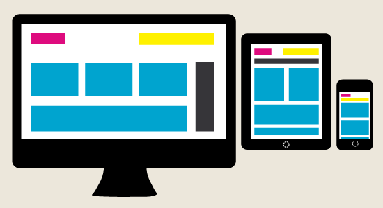 There are many standard responsive web design patterns that are used these days for mobile applications; however new patterns are ideal for those people who want a bit of excitement and challenge when they are creating a layout for mobile websites. Listed below are the top 5 responsive web design patterns and one best responsive web design pattern that are both aesthetically pleasing and practical to use.
The Best of Responsive Web Design Trends
Design 1 –Small and Narrow Columns
By assigning a fluid column to a page that contains a column of contents you can achieve a good layout especially if you design the page to decrease in width until only one significant jump into a column is left on the page. An example of this kind of layout is used on luxury hotel websites such as but not limited to 137 Pillars House. The benefit of this layout is that, it takes a relatively lesser time to create and it also looks good on a number of mobile devices with various resolutions.
Design 2 –Simple and Large Content Areas
Creating a webpage with three large areas of content that are separated with simple yet thick lines is both aesthetically pleasing and practical for both designers and end users. This can be considered as the best responsive web design patternas the integrity of the page does not get compromised even when the browser is minimized under a significant reduction of width of the selected web page.
Design 3 –Large Photo Columns that Capture the Interest of Users
This pattern might be considered as the best responsive web design pattern by people who want to display big pictures on websites, without overcrowding the website with too much content. This design basically has large boxes of photos, with 2 columns created using bright colours and minimal content.
Design 4- Thumbnail Galleries on Internal Pages
Simple rectangles that are neatly arranged on a page with a solid background often a pastel colour or a light colour gives the website a minimal and clean look. Such websites ensure that there is a reflow with every viewport change provided the columns have been reduced a few times while designing the website.
Design 5 –Three Column Gallery
This style is very simple yet efficient as it begins with three simple gallery columns on the home page that soon reduces into to a double column. This column further on transforms, into a layout that has only a single column at the very end.
Conclusion
There are a myriad of possibilities when you decide to experiment with designs and while I is easy to find top 5 responsive web design patterns to use, the real question arises which is the best responsive web design patternfor your website. Keeping your demographic population along with your business needs can help you understand which web design to select and which design to stay clear of.


 +91 8277203000
