Responsive Web Design Trends That you Should Follow in 2018
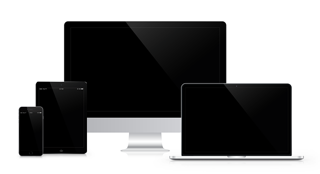
With the rise in Smartphone users, the traffic drive for mobile-ready websites has gained a huge surge. Websites around the world are slowing transitioning from static state to dynamic state. With more responsive websites, users are becoming more tech-savvy and more literate about the website designs.
You May Also Like: Best Responsive Web Design Trends for 2017
It’s a challenge to web designers, from creating websites that provide seamless user-experience; they have to make the users experience something new every time. Even though being with the trends is a common practice, web designers may feel little overwhelming addressing such a common issue. So, in no particular order, I have explained new responsive web design trends that should be followed in 2018 and help you continue with your good work and give users a rich-experience.
-
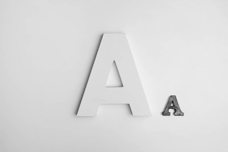
1. Focus on Right TYPOGRAPHY
- It’s now the psychology of typography. 2017 has been completely about the psychology of color, now it has been passed on how the words should be made presentable. It’s not a radical transition, from color to words; it all revolves around how a user interprets your website.

- Hence it will be completely natural if we find more restrictions in future about how a website should be made presentable. Now coming back to the typography, you cannot strain visitors while they are reading your content. Also, you may ask can’t people be just content with Arial or Georgia? Why give so much importance to such a small thing?
- The answer lies in BRANDING.
- The words you choose as a message and the way you visually present them can have an immense effect on viewers. But let’s not further about branding. Coming to responsiveness, the fonts you use should be flexible – they should be responsive typography. So from choosing the right font type, color, to getting legible line heights, line lengths, font sizes you can make the website typography fluid and responsive for different screen sizes.
-
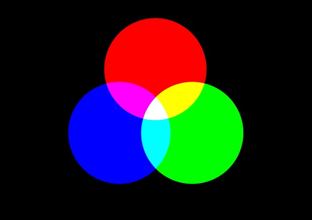
2. Make USER-INTERFACE more Colorful
- I think at least some of us should stop with this stodgy white space and minimalist concept. Enough of the bare, we dedicated 2017 getting sticky professional upfront, it’s time we get little colorful.
- The website UI design counts completely if you are to engage customers who land on your website. Responsive technology makes your website appear and works consistently on different devices, so why not visually make them more refreshing by using colorful user-interface?

- I’ll give you a good reason to go colorful. Plain colors are taken by large brands, Instagram changed the trend by going with gradient, and even Spotify followed the concept, so it will do no harm if you join the line.
-
3. Vertical Display of ELONGATED MENUS
- One of the integral purposes of responsive technology is to ensure good user-experience for mobile users accessing a website and that includes even the navigation system.
- When you have a large menu, horizontal menu bar open with different height and width and that is bad if a website is being accessed on a SmartPhone.
- A vertical navigation contradictorily looks great on all the devices. The menu bar opens up with the same width and height irrespective of what device you are going to use.
- It is therefore convenient for both designers and users if the vertical navigation bar is used for the responsive design layout.
-
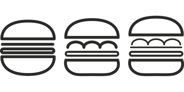
4. The Hamburger Menu
- The three-lined drawer navigation that’s how we refer the hamburger menu, right? It’s the most controversial UI design pattern hated by many, but still, we can see that it is just getting stronger by the day.
- Let me tell you why we need the hamburger menu for our responsive websites.

- Now let’s say you have landed on a website, a responsive website, you want to enjoy the home page, but you are not able to do that because something is distracting you from doing that.
- THE NAVIGATION MENU.
- The menu, it is just coming around distracting you from looking what’s on the homepage. The thing is you don’t want to access the navigation menu, but it is still appearing. It’s quite a distraction, enough to put off your interests.It could be still worst if you experience the same when you are accessing the website on a Smartphone, your view will be completely blocked by the navigation menu.The solution for this – Hamburger Menu.Irrespective how big your product list is, by using the hamburger design pattern you can keep the navigation structure compact and access only when you desire to.
-
5. Illustrations
- Adding those fun elements, you will enhance the way you visually communicate with your customers.

- Modern graphic designers understand the importance the way a customer is to be enlightened about something. You graphically illustrate the concepts so customers find it more relaxing and easy to interpret what you are saying.
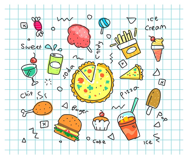
- If you are selling some software, it is necessary you include procedures and instructions, but the monotonous critical explanation may prove complex to understand. But it will be not if you make use of illustrations. Yes, you can give them a comfortable reading experience if you combine your good content copy with simple illustrations.
- But how exactly illustrations appear?
- Look at the above image example that has been provided. They resemble something like that.
- Or if you have heard about cave paintings, then illustrations looks something as similar. They are simple drawings, something that speaks on human level and are more attractive, engaging, and interactive than stock images.

 +91 8277203000
