5 Basic Principles of Website Design
 Today a website is necessary, necessary to do business and people know this. But even then most of them either don’t have a website or even if they have it is unusable.
Yes, it’s simply out of question to expect conversions from a website, which is designed without planning. A professional website designer today should also think as a marketer before he designs a website. Now suppose your website is not fetching you the basic advantages, why do you think it is like that?
It’s because your site is failing to connect with the audience.
And you are not with the audience because the web design principles are neglected.
Web design principles are to be adopted and they definitely demand exclusive attention.
And doing so it helps you creating a user-centered website design.
Introduction: User-Centered Website Design
Be it a mobile application or website, developers need to focus on their user’s behavior and approach towards the product.
Focusing exclusively on (UCD) user-centered design allows you provide a good user-experience (UX) for your target audience.
User-experience is very crucial and web designers have to get it right.
UX clearly defines how a user feels while using your website or application.
And you can get the ‘UX thing’ right provided you follow the basic web design principles.
A good website design is beyond the visual beauty. It may take the top priority, but audience looks beyond that visual element. So it’s necessary to find and design so they feel more connected to stay back and spend more time on your website.
In this blog post, you will be guided to top web design principles, which are crucial and need to be followed if you are planning to create one.
Know these 5 Web Design Principles
Principle I- Define Business Objective
Whether you are hiring a website designer or designing a website for a client, your first responsibility is to know this.
‘What is the purpose of this website?’
It’s the most harmless question, but if you neglect, your whole work will be a waste. If you find an answer to this question, you will be successful in designing the information required for ‘above the fold’ website section and the CTA button.
I’ll take a simple example to explain this concept.
Suppose you are giving internet marketing services, your CTA would have content that would relate your product.
Something like ‘Get Free Marketing Tips’.
People looking for internet marketing services would definitely click this button and of course, it will be one of the kinds of conversions for you.
Now, it’s not the only question that you should find answers for.
How do you want your customers to convert?
If you are a blogger you would expect them to read your blogs and articles. And if you are running an e-commerce business, you would like them doing business with your brand.
The requirement differs and it’s necessary that your requirement is reflecting in your website designs.
In what form you expect a conversion to happen?
What do you want your customers to do?
Fill a form? Download software or an E-book? Make an online purchase, or simply sign-up for the newsletter.
All these questions should be obligatory for your web design checklist.
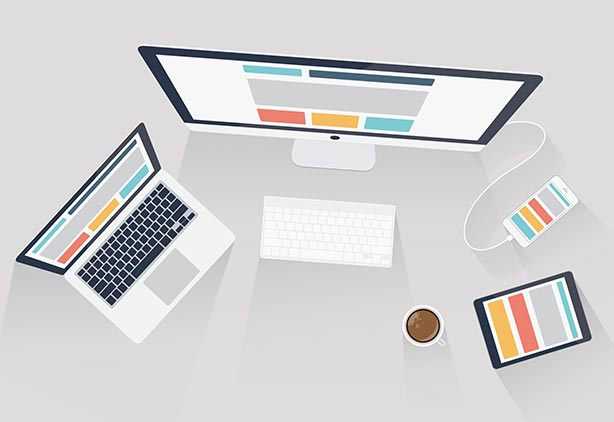
Principle II- Your Website Design should also reach Mobile Users
You can hardly find that demographic who are still hammering old PCs.
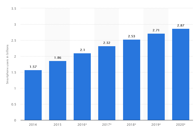
(Statista.com)
What do you make out of this?
As per the reports, I can confidently predict that mobile users will only increase. So whatever you do, you should not go out of their sight.
Your future lies in the hands of these SmartPhone users.
Responsive technology is not new, but if you are new to that your website will definitely bite the dust. I’m giving you the actual fact. People love websites that serve them consistently on desktops and mobile devices.
As they expect, it is necessary to make your website design fluid and dynamic across all browsers and devices.
Wait, I’m not done yet, it’s not only your audience, but even search engines prefer mobile-friendly responsive websites.
Principle III- The Website Navigation, keep it Simple and Intuitive
While you are designing a website, it is necessary to keep the design as simple as possible. Your audiences are not professionals; they are normal human beings who prefer getting what they want with less effort.
So, when they land on a website and prefer navigating through the site, they expect it to be less stressful. And you, instead of creating a map, have designed a maze; they would switch websites after two minutes.
TIPS FOR DESIGNING GOOD WEBSITE NAVIGATION, SMOOTH UX
- Maintain consistency throughout the website.
- Avoid single drop-down menu, chose a mega drop-down menu.
- Let the user/customer get access to information with less number of clicks.
- Promote search bar, place it in a prominent spot.
- Link the logo back to the homepage.
When users feel easy reaching their target, they would stay back for a long time looking for things. Longer they stay, higher will be the chances of conversions.
Principle IV- Image, Fonts, Colors – Use them wisely
Image optimization, color-coordination, and minimal fonts make sure your work is covering all these.
All these factors affect readability.
- Colors should not be harsh but have to be as soothing as possible for the eyes.
NOTE – Your website design should also be accessible to the audience with color blindness.
- Fonts, keep it as simple as possible.
PRO-TIP – Use Serif fonts for headlines and sans-serif for body text.
- Coming to images, my first advice, avoid flash.
TIP- Keep the images optimized, because heavy image size affects page loading time.
Principle V- ‘Content is the King’, don’t FORGET this
You are designing a website so that you can share something you have to the world. If your website has to speak human then use words that will help you to do so.
When I say content, it doesn’t just limit to blogs, well that is a common perception, but also includes product descriptions, photos, videos, infographics, or any other means that would provide information to web browsers.
‘Content is king’, do you know why it is called so?
Because it is the most cost-effective ways to promote a brand.
Just know these few general facts,
- A website is of no use to a business, unless it earns a good number of visitors and makes a good number of conversions.
- People don’t go to websites (mostly) that are beyond the search result page. (So your website should be one of the top 10).
- To be one of the top 10, you should either spend exclusively on the ad campaigns or create good content for users.
- If users like your content, then search engines will like your content. And if search engines are impressed with your content, it will not be much time before your website lands in one of the top 10 positions.

 +91 8277203000
