Is Your Website Costing You Customers? 7 Signs to Check Right Now

Most business websites look fine on the surface. Traffic arrives, the pages load, the design looks contemporary. But “looking fine” and “converting visitors into customers” are two very different things—and the gap between them is where a lot of businesses quietly lose revenue every month.
A website costing customers often shows subtle warning signs before sales begin to decline. Slow loading pages, confusing navigation, outdated content, weak calls to action, and poor mobile experiences can all discourage potential customers from completing their journey. Identifying and fixing these issues early helps businesses improve customer confidence, engagement, and conversions.
The default response when leads dry up is to spend more on digital marketing services: more ads, more SEO, more content. Those investments can help. But if the website itself is creating friction—slow load times, confusing navigation, missing trust signals, poor mobile experience—pouring more traffic into it doesn’t fix the underlying problem.
Here are seven specific signs that your website may be working against you, and what each one is likely costing you.
Sign 1: Is Your Website Costing Customers? Traffic is growing but enquiries aren’t
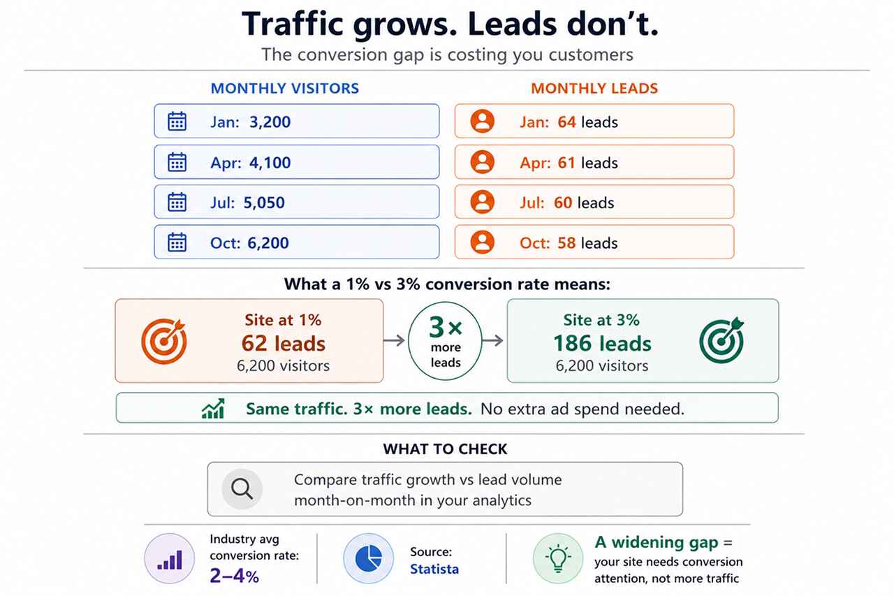
This is the most common—and most misread—warning sign. When visitor numbers climb while leads stay flat, it’s tempting to assume the marketing is working and the sales process needs attention. Often, the problem is earlier than that.
If your site converts at 1% and a competitor converts at 3%, they’re getting three times the enquiries from identical traffic. Industry data shows average conversion rates typically sit between 2–4% across most sectors—which means the majority of sites are underperforming what’s achievable without any additional traffic investment.
What to check: Compare month-on-month traffic growth against enquiry or lead volume. A widening gap between the two is a reliable signal that the conversion experience needs attention.
Sign 2: Visitors leave before they reach a decision point
High exit rates on service pages, short average session durations, and low page depth all suggest that visitors are leaving before they’ve formed a view on whether to contact you.
Research from UXCam suggests that the great majority of users who encounter a poor experience on a website are unlikely to return. That makes each abandonment more expensive than it first appears—you’re not just losing a visit, you’re likely losing that person entirely.
The cause is often structural rather than cosmetic: unclear navigation, no logical next step from one page to the next, or content that describes your business rather than addressing the visitor’s actual question.
What to check: In Google Analytics, review the exit rates on your top five landing pages. If visitors are leaving consistently from a page that’s meant to drive contact, look at whether the page actually answers the questions a potential customer would bring to it.
Sign 3: The site loads slowly, particularly on mobile
Speed is not just a technical metric—it’s the first experience a visitor has of your business. A page that takes four seconds to display has already communicated something about your organisation before a single word has been read.
Google’s Core Web Vitals framework measures loading speed, input responsiveness, and visual stability as direct indicators of user experience. Poor performance on these metrics affects both search rankings and the conversion rate of the traffic you’re already receiving.
Mobile is where this hurts most. Research cited by Forbes indicates that mobile users are particularly likely to abandon slow-loading pages—and with mobile accounting for the majority of web traffic in most industries, that’s a significant proportion of your potential customers.
What to check: Run your site through Google PageSpeed Insights (free tool). Pay particular attention to the mobile score and any Largest Contentful Paint or Cumulative Layout Shift issues flagged in the report.
Sign 4: The content answers your questions, not theirs
Most website copy is written from the inside out—describing what a business does, how long it’s been operating, and what makes it different. None of that is wrong, but it’s rarely what a visitor is looking for when they first arrive.
A potential customer visiting your website typically has a specific set of questions in mind:
- Can this business solve the problem I’m dealing with?
- Do they have relevant experience in my situation or sector?
- Is there enough evidence that they can be trusted?
- What would working with them actually involve?
When a website doesn’t address those questions clearly—or buries the answers several pages deep—visitors make a quiet decision to continue their research elsewhere. They don’t fill in a contact form to tell you why.
The UX Design Institute has documented that websites designed around user decision-making consistently outperform those built around internal priorities. The distinction is usually visible in the first ten seconds of reading the homepage.
What to check: Read your homepage and key service pages as a first-time visitor with a specific problem to solve. Does the page help you understand—within thirty seconds—whether this business can help you and what to do next?
Sign 5: Mobile users hit unnecessary friction
Responsive design—where a site reflows to fit smaller screens—is now standard. But responsive and genuinely mobile-friendly are not the same thing. A site can technically work on a phone while still delivering a frustrating experience.
Common mobile friction points include small tap targets, text that requires pinching to read, contact forms that are difficult to complete on a touchscreen, and navigation menus that obscure content. UXCam reports that mobile users are significantly more likely to abandon a task when the experience isn’t properly optimized for their device.
For most businesses, mobile visitors now represent at least half of all website traffic. A mobile experience that introduces friction at key decision points is not a minor inconvenience—it’s a systematic conversion barrier.
What to check: Navigate your own website on a phone, completing the actions a customer would: finding service information, reading a case study, and submitting an enquiry. Note where the experience slows or becomes awkward.
Sign 6: There’s not enough evidence to build trust
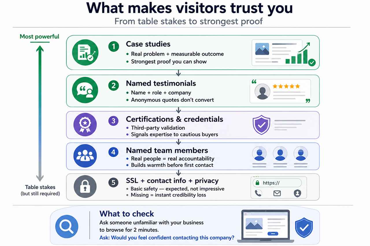
Visitors evaluating your business for the first time are doing a risk assessment. They want to know whether it’s safe to contact you, share information with you, or spend money with you. Your website’s job is to make that assessment easy—by giving them the evidence they need.
Research collected by Maze indicates that users form initial impressions of a website’s credibility within milliseconds. Those impressions are shaped by visual professionalism, but sustained or destroyed by what the content actually shows.
Trust signals that make a meaningful difference include:
- Client testimonials that include the person’s name, role, and company—not anonymous quotes
- Case studies showing the problem, approach, and measurable outcome
- Relevant industry accreditations or recognised partnerships
- Named team members and accessible contact information
- A clear, professional visual presentation that reads as current
For professional services and B2B businesses in particular, the absence of these signals is often the deciding factor in whether an enquiry is made or not.
What to check: Ask someone unfamiliar with your business to browse your site for two minutes, then ask them: “Would you feel confident contacting this company?” Their answer, and the reasons behind it, will tell you more than most analytics reports.
Sign 7: Your analytics show activity, but not performance
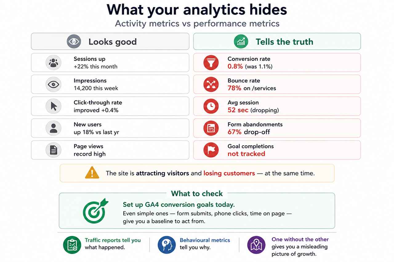
Sessions are up. Impressions are growing. Click-through rates have improved. These are genuinely useful metrics—but they can create a misleading picture of website health when they’re the only things being tracked.
The metrics that reveal whether a website is actually working for your business are different:
- Conversion rate (the percentage of visitors who take a desired action)
- Bounce rate by landing page (which pages are failing to engage visitors)
- Session duration and page depth (how far into the site visitors actually go)
- Form abandonment rate (how many people start a contact form but don’t submit it)
- Goal completions (tracked in GA4 against specific business actions)
When these behavioural metrics are tracked alongside traffic data, a clearer picture emerges. It’s often possible to identify the exact pages or journey stages where potential customers are being lost—and that precision makes improvement far more straightforward.
What to check: Set up conversion goals in GA4 if you haven’t already. Even simple goals—contact form submissions, phone number clicks, time on page thresholds—will give you a baseline to work from.
How to evaluate your website from a customer’s perspective
The most useful exercise most businesses can do costs nothing. Take the role of a potential customer—someone who has a problem your business can solve and is researching their options—and use your website as they would.
Ask yourself:
- Is it immediately clear what this business does and who it’s for?
- Can I find the information I need without hunting through the navigation?
- Does the content give me enough evidence to feel confident?
- Does the experience work as well on my phone as on a desktop?
- Is the next step—contacting the business, requesting a quote, booking a call—obvious?
Each point where the answer is “no” or “not easily” is a point at which a real customer may be leaving. Websites that evolve based on this kind of structured evaluation—rather than aesthetic preference or habit—consistently outperform those that don’t.
Businesses investing in professional website development that centres the customer’s decision-making journey—rather than the business’s internal structure—routinely find that conversion improvements deliver stronger commercial returns than equivalent investment in additional traffic acquisition.
Find out what your website is actually doing
A website audit doesn’t have to be complex. The most valuable insights often come from a structured review of the pages that matter most—assessed against the questions your potential customers are actually asking.
At Adroitte, we work with businesses to identify the specific points at which their website is creating friction, losing trust, or failing to support customer decisions. Our approach combines performance data, user experience analysis, and commercial context—because fixing the wrong things rarely moves the needle.
We can help you:
- Identify the pages and journey stages where visitors are most likely to leave
- Evaluate performance across desktop and mobile against current benchmarks
- Assess trust signals and content effectiveness from a customer’s perspective
- Build a prioritised plan of improvements linked to commercial outcomes
- Improve search visibility and user journeys in tandem so traffic and conversion improve together
If you’re not certain whether your website is helping or limiting your business growth, that uncertainty itself is worth resolving. Get in touch and we’ll help you find out.


 +91 8277203000
